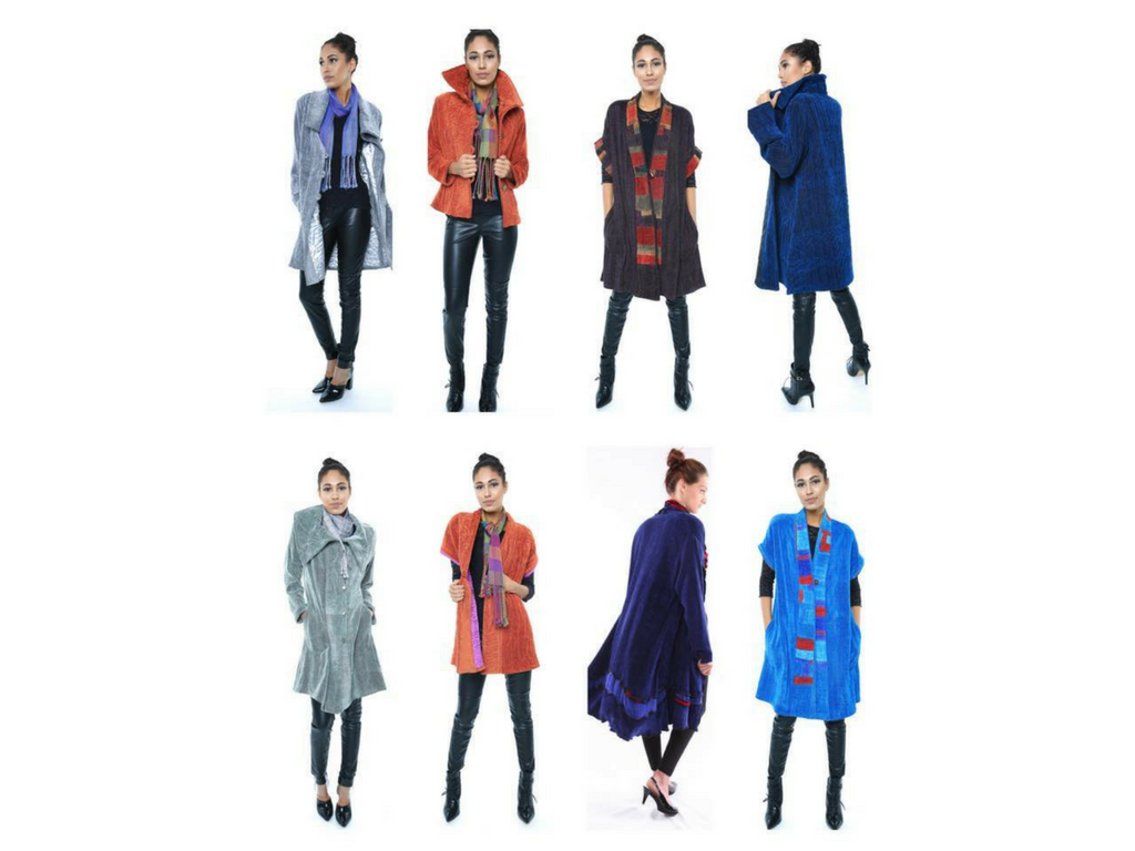
A painterly approach to creating a multi-colored warp
- Karen Gelbard

- Sep 11, 2024
- 3 min read
Updated: Sep 19, 2024
Every once in a while, I like to share information with you on how the fabric is woven and the work that goes into it. Eventually, you will be knowledgeable enough to speak with confidence about it and draw upon this information for your own warping projects.
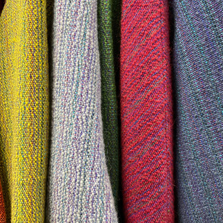
Color in weaving is different than painting. In paint, color can be physically blended to create different hues. In weaving, the color sits side by side, creating a pixelated effect. In my studio, where I weave yardage for jackets and coats, the mantra is to warp long and weave fast. This means creating warps 60-100 yards long to weave more than one weft color weft. The pictures above are an example of one multi-colored warp and 9 weft colors: yellow, light gray, green, red, charcoal, purple, teal, and black. The last image is a closer look at the light gray fabric. My use of a multi-color warp and different weft colors shows how the interaction of the colors has some colors receding and others popping to the forefront in different ways depending on the weft color.
Creating a multi-colored warp involves choosing color families and then creating color chords using the cones of yarn. Music training is part of my accumulated experiences, so this is an easy comparison for me. The primary colors of red, yellow, and blue are the major chords, and the secondary colors of orange, green, and violet are the minor chords. A wide range of colors can be used in the warp if they have a similar value or intensity. This is also a great way to use up smaller quantities of yarn that are leftover from other projects.
For long projects, I use my 60" wide AVL production Dobby loom with a sectional beam. My warping plan involves not having the same colors side by side. Doing so would create stripes in the warp. The second part of the plan involves warping every other 2” section on a beam. I change a few of the yarn colors in that original 2” section and add one accent color. After those changes, I go back and warp the remaining 2” sections on the beam. I try hard to avoid stripes in the warp. If the colors are distributed enough it will trick the eye into seeing a field of color, not stripes. No dominant stripes make it easier to cut out pattern pieces for the jackets and coats. If I want to add a more defined color transition, I add one yarn in a bigger size to mark the transition. The change of one yarn to a bigger size fools the eye into seeing a smoother transition.
In my mind, these color chords on the loom are much like music chords. I look for harmonies that vibrate. Spreading the colored threads out allows me to make a landscape of color, much like a painter. I accent a color transition with a bigger thread and use it as if it were punctuation in a sentence. The next step in the design process is cutting the handwoven fabric and designing jackets and coats. Let's discuss that another time!
Below are images from a second warping project that uses this painterly approach of a landscape of color in reds (plus maroon, scarlet, burgundy) and blacks (plus brown, dark gray, purples), yet with so much more than that, too! All of this creates rich undertones of color in the handwoven fabric.


Comments